🧪 UI Challenge April
Table of Contents

#
(Very) Brief Brief
For this month, the challenge I was given was to design a summary screen for a set crypto app. The restriction was to ensure that the screen would flow seamlessly from the previous, as if I was following a brand’s design system.
#
Original & Design Inspiration
The first part of the challenge involved breaking down the UI and components of the original design as well as the inspiration screens. From this activity, I gained a solid understanding of what features were needed in the summary screen, as well as the ‘grids’ & structural layout of the original concept.
This original concept was designed by Arafat Mahfuz on Dribbble.com.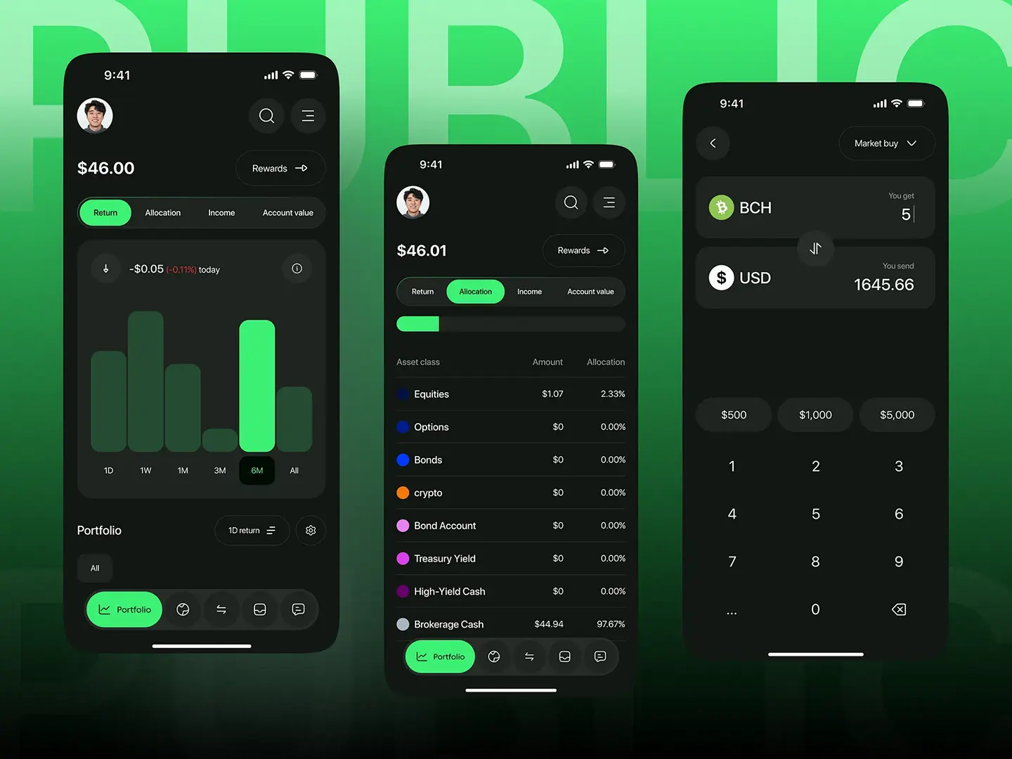

The three screens (above) were given as part of the initial brief, to indicate what features would be needed and competitor layouts. The screen on the left shows how I broke down each concept and original design.
#
Components & Interface

Components and interface
#
Outcome & Design Feedback
I was really happy with the feedback I recieved from Ines Mir, a UX industry veteran, and have definitely felt like the time I put into the challenge was well spent.
##
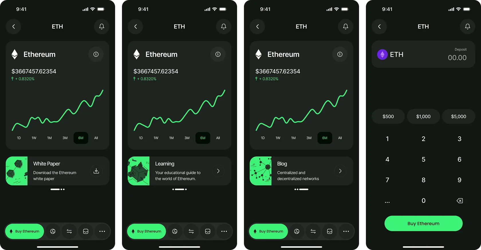
Outcome (Pre-feedback)

##
The good bits
Overall, Ines seemed very positive about my work, noting the attention to detail and consistency of the design, in that it followed the previous creator’s design principles to a tee. I was really glad she mentioned this, as I had spent hours pouring over the Figma file, diligently measuring every pixel and recreating icons to perfectly capture the original’s look and feel.
##
Some mistakes were made
The main points that were noted is that I could have done a better job with the information architecture - particularly with the float at the bottom of the screen which seemed a little confusing. This is because in previous screens, the float is established as a tabbed system, where users flick from screen to screen by tapping icons on the float. In my screens, I broke the pattern and introduced a different mechanic, which can critically impact the overall ‘flow’ of the app. To remedy this, I would potentially add a step-down on the float menu to indicate that the buy button is nested within that particular screen, or as she suggested, collapsing the icons into a dot menu.
On a minor note, she also reminded me to not be afraid of experimenting with different textures and effects to uplift the UI and give it more character. Since much of my experience has been designing for b2b during the minimalist era, I often self-restrict this experimentation based on habit - though this is something I plan to break away from.
##
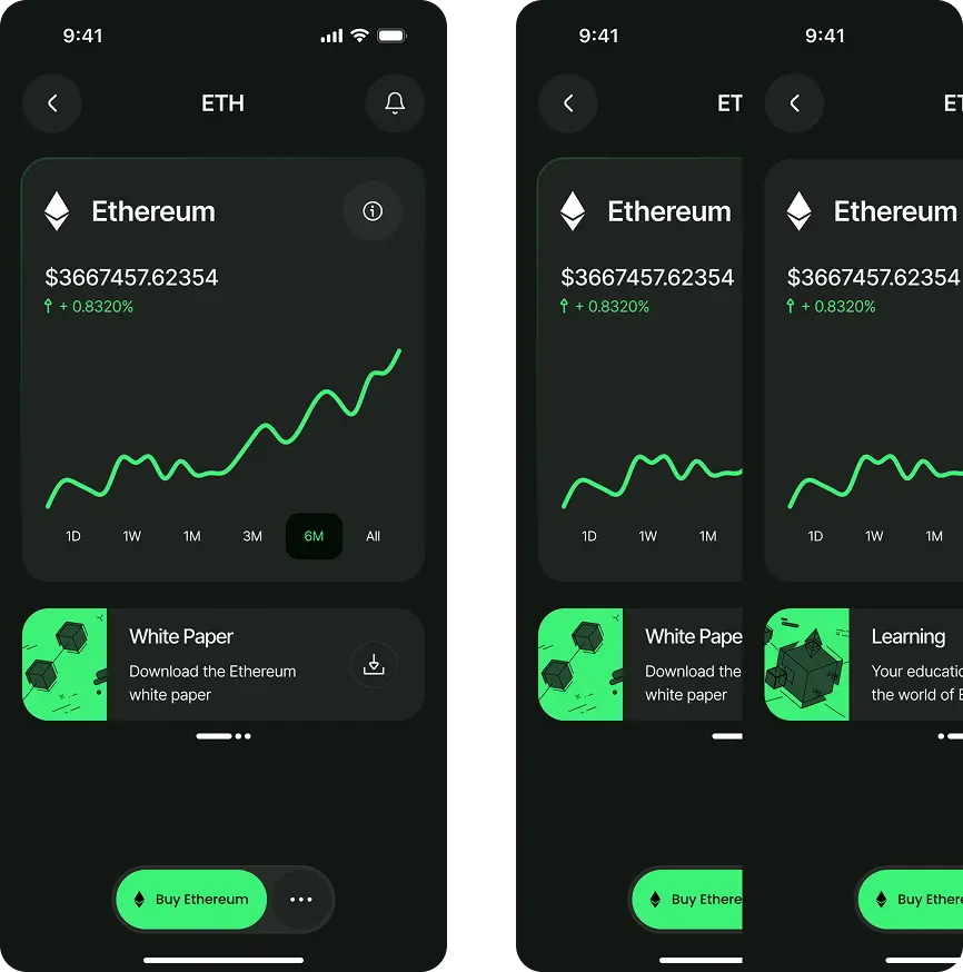
Final versions

Version 2: Stepped float menu

Version 3a: Smaller float menu
Version 3b: Stylisation comparison and final version